Friday, July 31, 2009

Newspaper Flowers

A friend from work got this great new punch at a craft store -
its a gi-normous flower from EK Success.  She made some of the cutest newspaper flowers - so I CASEd the idea for my next camp


The flowers are made up of 3 layers of punched newspaper flowers.  I  dabbed them with Summer Sun craft ink, then dried them with a paper towel.  I finished the flower off with a vintage chocolate button center tied with twine.

The "stem" of the flower  is layers of dark chocolate and kiwi kiss. 
The sweet sentiment is from Everyday Button Bits.
Thanks for stopping by!
{From me to you card supplies - PTI unless noted}
Stamps: Every Day Button Bits
Paper: White, Dark Chocolate, (SU!) Kiwi Kiss, the Classified Ads
Ink: (SU!) Chocolate Chip, Summer Sun craft
Tools: EK Success flower punch
Embellies: (SU!) 1" chocolate stitched  grosgrain, (PTI) chocolate vintage buttons

Monday, July 27, 2009

A little birdie told me ...

After getting my new box of Papertrey goodness, I wanted to make a simple card for my monthly stamp camp.  I love sharing all the goodness , but we are also limited to 1 hour (stamping at lunch is such a great break in the day!)

I thought a fun little hello card would be great this month and the Enchanted Evening buttons are so lovely I thought they would make a great "blue bird of happiness"

I love (love love) this blue. 
I stamped a border from Borders&Corners: Squares, then the rolling hills and bird parts from Everyday Button Bits
The embossed square is a nestability, that I embossed only (the tutorial is on StampTV)
The sentiment is also from EveryDay Button Bits as well
Thanks for stopping!
{Blue Bird card supplies - All PTI unless noted}
Stamps: Everday Button Bits, Borders & Corners: Square
Paper: White, Enchanted Evening
Ink: Enchanted Evening, Momento Tuxedo Black, SU! Old Olive
Tools: Copic Y35
Embellies: Enchanted Evening vintage buttons, twine

Saturday, July 25, 2009

July PTI Blog Hop - Text Style

This month's blog hop is using text in different ways.  I came up with 2 cards this month so make sure you scroll all the way to the end to see the SMB (sock monkey bandit - lol)
I loved this idea and played around for several hours one Saturday trying to come up with a project. 
I used my Texture Plate with the font on it and ran it through my big shot (spritzing both sides of the paper to get a better impression).  Then dragged my PTI Vintage Cream ink pad lightly over it  I didn't worry if it got in the "in between" spaces - because that just makes it look old and distressed and I love old and distressed :o)

For the focal image I stamped the solid  and outline coffee cup from Warm Happiness and then masked and stamped Background Basics: Text Style.  Love how the cup just seems to float.  I distressed the edges the Vintage Touch Tea Dye Duo - just using the Chai.

On the left of the card I used a background-making technique Nichole Heady showed in this post.  I just loved the look!  I made my striped background in latte colors to go with the coffee theme.  I wanted to stitch around the layer but my thread kept tangling so I just used my sewing machine as a "power piercer" and faux stitched it with my white gel pen.

And this month I have 2 cards ... a friend and I were talking at work how I threatened my stamping group with a "sock monkey card per month" for a whole year.  I personally love the sock monkey, but I realize not everyone does.  So anyway we talked ourselves into this whole revenge of the sock monkey storyline, with the SMB (sock monkey bandit) stealing all of Lisa's couches from the On My Couch set. 
Here were the headlines on that fateful day!
The mask was paper pieced and I punch holes for the eyes using a hand held circle punch.  The newspaper story is Background Basics: Text Style masked with strips of post it notes.  The "From the Archives" was printed on transparency window sheets using Copperplate Gothic font and then embossed to set the printer ink.  I aged the paper using Tim Holtz Distress ink in Antique Linen and Tea Dye.
Here is the whole card in all its zany-tastic-ness
Thanks for stopping by.  Enjoy the rest of the hop!

{Coffee Card supplies - PTI unless noted}
Stamps: Warm Happiness, Background Basics: Text Style
Ink: Vintage Cream, Vintage Touch Tea Dye Duo - Chai,  (SU!) Chocolate Chip
Paper: (PTI) Kraft, Vanilla, Melon Berry, Dark Chocolate, (SU!)Close to Cocoa, Soft Suede
Tools: Texture Plate Kit #4, Friend definition (SU!), big shot

{Sock Monkey Bandit supplies}

Stamps: (SU!) Sock Monkey, (PTI) On My Couch, Mod Squad, Background Basics: Text Style
Ink: (PTI)Vintage Cream, Tim Holtz Distress Inks - Antique Linen &  Tea Dye , Momento Tuxedo Blank, Copics, (SU!) Basic Gray
Paper: (PTI) Kraft, True Black, White

Tuesday, July 21, 2009

Kristina Werner Color Challenge - late

I wanted to make this card Saturday but a few things got in my way that I had to take care - no putting off a blown light switch.  So I missed the deadline for the challenge, but still wanted to make the card, so here it is:

I did the layered strip background again - this seemed the perfect challenge for it, with so many colors involved.   I also used my "power piercer" (aka sewing machine) and white gel pen  to faux stitched the striped layer.
For that larger circle layer, I used something I learned over the weekend at a SU! demo meeting (although I don't talk about it much, I have been a demostrator for over 5 yrs now).  That larger 2 " red circle is actually 2 round tab punches layered over each other.  The round edges overlap into a perfect 2" circle - so cool!!!  When you line it up right you can make a perfect 2" hole through a layer too.
After that I stamped a sentiment from Around & About Sentiments and punched with a 1 & 3/8" circle punch.  I finished it up by sewing a red button in the center with white jute.
Thanks for stopping by!
{Congratulations card supplies - All SU! unless noted}
Stamps: Around & About Sentiments (PTI)
Paper: Riding Hood Red, So Saffron, Certainly Celery, Pumpkin Pie, Ballet Blue, white
Ink: Riding Hood Red
Tools: sewing machine, paper piercer, circle punch, round tab punch
Embellies: Red button , white jute(PTI), white gel pen

Saturday, July 18, 2009

SFYTT Saturday

I've looked at Jen del Muro's Sketch For You To Try on many a Saturday, but have never had a free day to actually try it until today.

The girls are with their dad this weekend, I am actually in town and have nothing on the calendar!! That is a rarity in my life this summer. So I am taking full advantage of it, and doing what I want - which is to play with paper (and my dog - Happy birthday to Abby - she is 3 today!

isnt she adorable!  She is a lab mix that our family has been fostering for the last year.  I found out a couple of months ago that we get to keep her so we are all extremely happy and this birthday and the "gotcha" day - when we got her last year -  which is July 20 are going to parties at our house!)

But I digress ...

Cards ... thats why you are here.  Here is my attempt at the SFYTT for today:


I used a Baha Breeze card base played around with text backgrounds to get ready for the blog hop at Papertrey Ink this month. 

On the chocolate layer I used my Friends definition Texture plate from SU! Kit #4.  I had heard that if you spritz the paper you get a better impression so I tried it out - spritzing both sides.  I did get a good impression, but because I so love the distressed look, i dragged my PTI Vintage Cream ink over the impression to bring it out even more.  Added a little Tim Holtz Distress Ink in Vintage Photo to age it some more.
For the focal layer I stamped the solid coffee cup from Warm Happiness along with the saucer, using the Baha Breeeze ink.  I added the outline in chocolate then masked and stamped Background Basics: Textstyle over that in Creamy Caramel.  Again with the Tim Holtz distress ink - it matched the caramel amazingly well, and the text behind the mug really makes it pop, don't ya think.
I finished off with a piece of Soho Hardware that says "fabulous"! 
I will use this card to invite my dear friend Dee to coffee.  We meet once a month before I go off to volunteer at a residential facility for at risk kids leading a scrapbook class and she goes off to Toastmasters to astound and amaze the masters with her speaking prowess :o)

Thanks for stopping by!

{Coffee Card supplies}
Stamps: (All PTI) Background Basics: Textstyle, Warm Happiness
Paper: (SU! and PTI) Dark Chocolate, Baha Breezer, Old Olive, vanilla, white
Ink:(SU!) Creamy Caramel, Chocolate Cip, Baha Breeze, (PTI) VIntage Cream, (Tim Holtz) Distress Ink Vintage Photo
Tools: Texture Plates Kit#4, circle punch, Big Shot
Embellies: Soho designer hardware

Wednesday, July 15, 2009

Cupcake Birthday

I finally broke into my Cosmo Cricket Girl Friday papers.  I found them at a local scrapping store about a month ago and have just been admiring them ever since.  But I thought that our admin's birthday was a good reason to break into my stash.  Carol is awesome and deserves so much more than just a card., but since it was a special birthday I used special paper (and glitter too!)

The card base is a 4.25" square in Aqua Mist.   In addition to the Cosmo Cricket paper I used my brand new Cupcake Collection stamps from PTI - they are just the cutest!
See the glitter!  Ooooooo - sparkly!
{Cupcake Birthday Supplies}
Paper:
   Patterned - Cosmo Cricket: Girl Friday
   Card Stock: Aqua Mist, Ocean Tides, SS White (PTI), Pixie Pink (SU!)
Ink: (all SU!) Baha  Breeze, Pixie Pink, Pink Passion
Tools: Copics (Y35, Y38) - SUmmer Sunrise trio, circle nestabilities (Spellbinders)
Embellies: glitter, lemon tart vintage button and lemon tart stitched grosgrain (PTI)

Monday, July 13, 2009

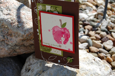
An Apple a Day

My friend's children are so adorable.  You might rememebr Ilze's lady bug and gingham birthday card.  Well she and her brother sent me some apples - little tiny apples - that had fallen from a tree.  But they wanted me to have them - really sweet.

Since they were a little too small - and mushy - to do much with, I decided to make apple prints and send them a thank you card.
I split one apple along the core and the other through the center to expose the hidden "star".  I painted them with olive craft ink and stamped to make the layer.  Some spritzing and heat setting and it was ready to go.
I added some old white viney flower rub ons to a chocolate card base and mounted the apple prints on old olive card stock.  I also added a new leaf vintage button at the end of the vine, tied with jute from PTI.
Then I made the focal apple using my water color wonder crayons and the retired Fresh Fruit set from SU!.  I over spritzed the stamp though after I colored on it and got some drips on the paper, but decided I liked the effect and started shaking off the excess water/color onto the stamped image.
I really like the splattered effect! 
Here is a better view of the apple prints, that I put inside the card
Thanks for stopping by!

Saturday, July 11, 2009

Cards For Heroes - Ready To Ship

I am sending out the Cards For Heroes cards today.
We made over 50 cards, plus had many donated cards.   As a demonstrator with lots of demonstrators friends, there are always samples lying around. I did not do a final count but I am guessing between 75 & 100 cards will be in the flat rate box when I ship it.

I separated them out into types (birthday, kids, friends etc) and bagged each group just in case there is a mishap enroute (its been storming a lot here in the Midwest lately so I don't want them to get ruined by weather.

I also had a friend donate a bunch of envelopes to help the cause.


Check out the Cards For Heroes website if you are interested in helping with this wonderful organization.

Thanks for stopping by!

Monday, July 6, 2009

July Stamp Camp Project

When I saw this mini pizza box the Splitcoast Stampers newsletter a few weeks ago, I knew I wanted to make it for my monthly camp.  I love the idea of small gifts (for teachers, or just as a pick-me-up for a friend or coworker)  I once made a little muffin box for a friend at work.  It really made her day.  I figure a mini pizza box filled with chocolate would be a super gift too.

I used the new Bermuda Bay and Melon Mambo card stock (now available from SU!) and the new Razzle Dazzle stamp set to make my own background papers.
The poor little box got crunched a little when I kept taking the belly band off.  The belly band was new melon mambo dotted grosgrain ribbon.  I sandwiched the ribbon between the melon and stamped layers.
The medallion was a combination of punches (melon mambo scalloped circle, white 1.25" circle, new Razzleberry Lemonade patterned paper and the new modern lable punch and white with the word window punch.)  The sentiment is stamped in rich razzleberry and is from the hostess set, Kind & Caring Thoughts.
I also stamped white mailing labels in rich razzleberry using the same stamp I used on the box to decoreate the inside too!
Thanks for stopping by!
{Mini pizza box supplies - all SU! except for the chocolate :o)}
Stamps: Razzle Dazzle, Kind & Caring Thoughts
Paper: Bermuda Bay, Melon Mambo, Razzleberry Lemonade DSP, white
Ink: Bermuda Bay, Melon Mambo, Rich Razzleberry
Tools: Scalloped circle punch, circle punch, modern label punch, word window punch
Embellies: Melon Mambo dotted grosgrain ribbon, 12 white mailing labels, 12 Hershey nuggets

Thursday, July 2, 2009

Here we go now - Raspberry Suite Color Challenge

Here is this weeks Raspberry Suite Color CHallenge. 

5 Colors? Five!?!? And strictly speaking no white/light neutral.  I had an idea in my head to use bleach and lighten up the gray/stone card stock.  It was something completely different in my head when I started this project, but I do like how this card came out.

I still bleached it  - I filled my aqua painter with straight Chlorox  and squiggled across the sentiment (it was embossed with black craft ink and clear EP).  There was also a little  red left on my sponge so when I did the edges, the gray and red mixed, creating an effect I really like.
I also stamped the Linen background to give it a fabric feel.  I finished it off with some satin ribbon and a leaf green button from PTI
Thanks for stopping by!
{Embrace Life card supplies}
Stamps: (All SU!) Kind & Caring Thoughts, Linen Background, Embrace Life (sentiment)
Ink: (All SU!) Real Red, Sahara Sand, Black craft
Paper: (All SU!) Going Grey, Basic Black, Real Red
Embellies: (All PTI) Raspberry Fizz satin ribbon, New Leaf vintage buttons
Tools: Bleach, aqua-painter, eyelet border punch (SU!)

Other Artwork

I don't have a card to share today, but wanted to post some of the artwork that is hanging around my house.  I have been taking the best 1 or 2 art projects my girls have done for the last 10 years and hanging them on the "art wall"  - complete with classy black frames and in some cases title and author tags (I stopped making the tags a few years ago, but I may start back up again - gives it a museum feel :o)

Here are a few collage shots of the walls:
Here is Detective Snowman, the sandpaper print and chocolate collage
This one has the MDF painting and comic strip
and last but not least the black and white, pencil and marker drawings
The latest projects haven't gone up yet.  They do self portraits/enlarging by taking a picture and then recreating it either in pencil or a color medium (my eldest is loving prismacolors in art class, but is slow to embrace my Copics - which is ok since them I don't have to fight her for them!)
So here is my gangsta wannabe youngest DD:
She loves to draw but ran out of time to do a lot of shading (thats what snow days will do to ya!), but I love it because I can see her in it - the look, the attitude, the set of her mouth - definitely my baby!  Her hair is much shorter now so I might have to make her make a new drawing so I have a more recent look.
My older one got to use those prismas again and made this for the final project of the year - studying the human form:
I had to take the picture off angle a little - wanted lots of natural light, but did not think about all the glare off the glass of that classy black poster frame!  She went outside the bounds of the assignment a little by making her face an "anime'" face.  Anime' is her fave form of animation / illustration and her room is adorned with drawings she has done for character illustrations for the stories she writes.  The teacher didn't dock her any points for it though.
Thanks for stopping by - have a great 4th of July

Basket of Daisies

I am really loving the new picnic basket set from Papertrey.  I also discoverd StampTV from GinaK as well as the CLASSRoom both of which teach awesome tutorials and techniques - these ladies are a-maz-ing ... so talented and creative.

So for my basket of daisies I copied from a  few people today.  Nichole Heady did the original basket (you can see it here), plus I added some nestability embossing (taught by Gina K)

A simple kraft card base started it off.  The daisies are colored with a white gel pen and Copics - E59, and YG97.
The basket was stamped on lemon tart bitty box paper from PTI and the small flower image was stamped on that.  The same colors were used on the small and large daisies.
The dry embossing was done using a circle nestability and my Big Shot (check out the tutorial on Stamp TV)

Thanks for stopping by!

{Daisy Basket card - all suypplies PTI unless noted}
Stamps: Vintage Picnic Baskete & VIntage Picnic Basket Sentiments
Paper: Kraft, Lemon Tart Bitty Box patterned
Ink: Momento Tuxedo Black
Tools: Copics, white gel pen, circle nestability, Big Shot